



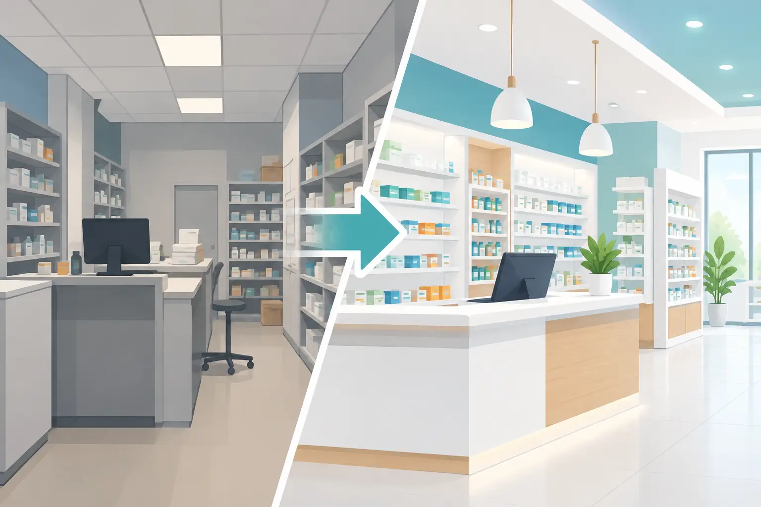
A pharmacy can look polished and still create pressure at every counter. When prescriptions, retail stock, consultations, deliveries, and patient questions all compete for limited space, the result is often staff congestion, longer waits, and a less private customer experience. This pharmacy renovation case study examines how a workflow-led fit-out can turn an outdated pharmacy into a more efficient, welcoming clinical retail environment.
Pharmacy Renovation Case Study: The Starting Point
The pharmacy in this representative project had built its operation gradually. New shelving had been added where space allowed, storage had moved into back rooms, and the dispensing area had become increasingly crowded as services expanded. The public-facing area felt dated, but the larger issue was operational: staff were taking unnecessary steps between dispensing, stock storage, checking, and handover.
The owner wanted a renovation that would refresh the customer experience without interrupting service for longer than necessary. They also needed better prescription workflow, more secure and accessible storage, a defined consultation area, and joinery that could stand up to constant daily use.
This is where pharmacy projects differ from a standard retail refresh. A pharmacy interior has to support a clinical process while remaining approachable to patients. It must allow team members to work accurately under pressure, protect privacy, accommodate regulated storage requirements, and present retail products in a way that is clear rather than cluttered.
The Design Brief Was About Movement, Not Just Appearance
Before selecting finishes or display systems, the project team mapped how people and products moved through the space. That included staff receiving stock, filling and checking prescriptions, patients waiting for collection, customers browsing retail items, and pharmacists conducting private conversations.
The existing layout forced these activities across the same narrow paths. Staff collecting stock regularly crossed behind colleagues serving patients. Prescription baskets accumulated near the counter because there was no dedicated staging zone. Patients needing a private discussion had to be directed away from the main service area, which was neither convenient nor discreet.
The revised brief focused on four practical outcomes:
- A clearer dispensing sequence with less cross-traffic behind the counter.
- Purpose-built cabinetry for medication, consumables, paperwork, and equipment.
- A private consultation setting that felt integrated rather than added as an afterthought.
- A more organized retail floor that made navigation easier for patients and customers.
These priorities informed every later decision. A visually impressive front counter would have been of little value if it reduced access to working drawers, created blind spots, or blocked the dispensing team from communicating effectively.
Planning the Front Counter
The front counter was redesigned as both a service point and a boundary between public and staff-only areas. The new configuration created distinct positions for prescription drop-off, collection, and general customer assistance, reducing the tendency for one queue to block every interaction.
Counter heights, transaction ledges, cable routes, storage drawers, and work surfaces were considered early. This avoided a common fit-out problem: installing attractive joinery first, then trying to accommodate printers, screens, payment terminals, label equipment, and power outlets afterward.
Durable, easy-clean surfaces were selected for high-contact areas. The finish palette remained professional and calm, with retail display zones used to add warmth and visual interest. In a pharmacy, the right materials need to do more than look good on opening day. They need to tolerate cleaning, daily impacts, and regular restocking without quickly showing wear.
Reworking the Dispensing Area
Behind the counter, the design introduced a more logical progression from prescription receipt to preparation, checking, storage, and collection. Frequently used items were kept close to the workstations, while bulk inventory moved into dedicated cabinetry and storage areas.
Custom joinery was particularly valuable here. Standard cabinets can leave wasted gaps, awkward corners, and limited drawer configurations. Made-to-measure units allowed the available footprint to work harder, with drawer depths and shelf spacing matched to the pharmacy’s actual stock categories and equipment.
The team also planned sightlines. Staff needed to maintain visual connection across the dispensing area without exposing private prescription information to the public. Screens, storage heights, and counter returns were arranged to support both supervision and discretion.
Managing the Renovation Around Trading Hours
A pharmacy cannot simply close its doors for weeks without significant consequences for patients and staff. The construction plan therefore needed to be as considered as the layout.
The renovation was divided into workable stages. Where possible, construction was scheduled around lower-traffic periods, and temporary service arrangements were planned before work started. Dust control, access routes, deliveries, and trade sequencing were coordinated to protect day-to-day operations.
The exact staging approach depends on the site. A pharmacy in a medical center may have stricter access windows than a standalone neighborhood store. A business with sufficient back-of-house space may be able to create a temporary dispensing zone, while a smaller tenancy may require more tightly scheduled weekend work. There is no one-size-fits-all program, but a detailed plan reduces avoidable disruption.
For this project, having one fit-out partner coordinate design, joinery manufacturing, trades, installation, and final adjustments made a material difference. It reduced the risk of cabinetry arriving before services were ready or multiple contractors making conflicting assumptions about dimensions and access.
The Patient Experience Changed With the Layout
The completed pharmacy was not simply more modern. It was easier to understand from the moment a customer entered. Retail displays were grouped more clearly, the counter was easier to approach, and the consultation area gave pharmacists a suitable setting for conversations that should not happen in a queue.
A defined waiting and collection flow also made the environment feel calmer. Customers could see where to go, while staff had more room to process prescriptions without constantly working around the public. That perceived order matters. Patients often arrive at a pharmacy when they are unwell, managing a new prescription, or collecting medication for a family member. A confusing layout adds unnecessary friction.
Privacy was another important outcome. The consultation space was designed to support discussions about medications, services, and health concerns without placing patients on display. Its location needed to be convenient enough to use regularly, not hidden so far from the counter that staff avoided it during busy periods.
What This Pharmacy Renovation Case Study Shows
The strongest pharmacy renovations begin with workflow questions. Where does a prescription enter? Who handles it next? Where does it wait? What stock is needed most often? Where can a pharmacist speak privately with a patient? Those answers shape the fit-out more effectively than selecting finishes in isolation.
It also shows why custom manufacturing can be a practical advantage. Pharmacies often operate in constrained footprints with unusual corners, existing service locations, and high storage demands. Off-the-shelf furniture may be suitable in limited areas, but it rarely resolves the full back-of-house and counter workflow. Custom cabinetry can be designed around the site, the team, and the equipment rather than forcing the operation to adapt to generic dimensions.
There are trade-offs to manage. More retail display can generate stronger product presentation, but excessive fixtures can narrow circulation and make the space feel crowded. A large consultation room offers greater privacy, but it takes floor area from other functions. Open shelving can make products easier to reach, while enclosed cabinetry can improve visual order and security. The right balance depends on service mix, staff numbers, available area, and how the pharmacy expects to grow.
A Better Process for Future Pharmacy Projects
For pharmacy owners, facility managers, and medical operators, the lesson is clear: treat renovation planning as an operational project, not a cosmetic upgrade. Bring together workflow review, site measurement, furniture and joinery design, services coordination, trade scheduling, and installation planning before construction begins.
Absolute Office Comforts approaches fit-outs with that end-to-end mindset. In-house manufacturing and project coordination allow the design intent to carry through from the first layout discussion to the final installation, with fewer handovers for the client to manage.
A well-planned pharmacy should make the daily work of dispensing, advising, stocking, and serving feel more controlled. When the layout supports the people doing that work, the improvement is visible not only in the finished interior, but in every patient interaction that follows.